
Overview
What’s the context?
What’s the context?
Splitwise simplifies managing shared expenses, yet many users experience confusion when splitting bills. This confusion has led to a growing number of lower ratings in the market. Motivated by these challenges, our project aims to significantly improve the app's usability and user satisfaction, making financial transactions within groups effortless and intuitive.
Goal
Goal
Our project aims to address cost-sharing within groups.
Problem
Problem
The current flows present challenges in configuring bills for division among members, resulting in a frustrated user experience.
Target Audience
Target Audience
Anyone who needs to split within a group
Potential Impact
Redesign can bring what kind of profitability?

Increase usage rate
Simplify the order distribution process, increase user usage and attract repeat and new customers.

Simplify complexity
Eliminate complex processes and simplify steps to resolve complexity.

Enhance visual appeal
Improve visual effects to enhance a pleasant user experience.
Potential Impact
Redesign can bring what kind of profitability?

Increase usage rate
Simplify the order distribution process, increase user usage and attract repeat and new customers.

Simplify complexity
Eliminate complex processes and simplify steps to resolve complexity.

Enhance visual appeal
Improve visual effects to enhance a pleasant user experience.
Potential Impact
Redesign can bring what kind of profitability?

Increase usage rate
Simplify the order distribution process, increase user usage and attract repeat and new customers.

Simplify complexity
Eliminate complex processes and simplify steps to resolve complexity.

Enhance visual appeal
Improve visual effects to enhance a pleasant user experience.
Potential Impact
Redesign can bring what kind of profitability?

Increase usage rate
Simplify the order distribution process, increase user usage and attract repeat and new customers.

Simplify complexity
Eliminate complex processes and simplify steps to resolve complexity.

Enhance visual appeal
Improve visual effects to enhance a pleasant user experience.
Solution
Add an expense
Add an expense
Add an expense
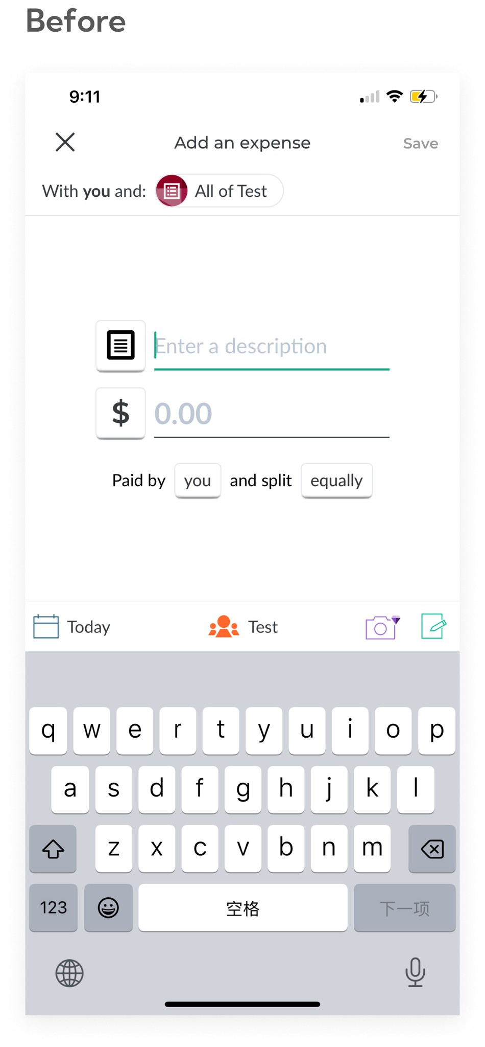
Before
"Add an expense," was represented by a plus sign, which was confusing. There were numerous clickable areas, leading to uncertainty about what could be clicked. Buttons of various shapes added to the confusion.
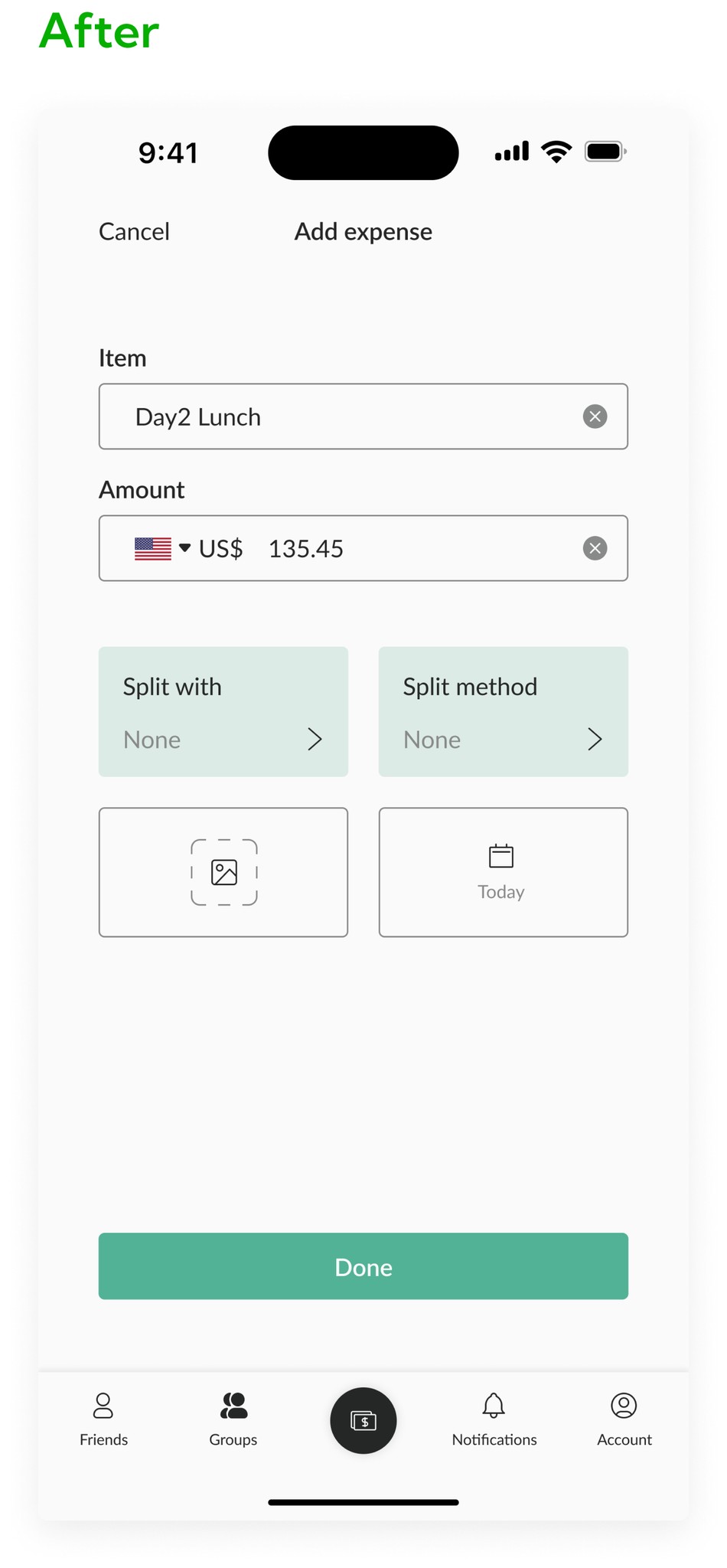
After
The primary icon in the navigation has been redesigned to more accurately reflect the concept of splitting expenses. Introduced a hierarchy to the clickable buttons, clarifying the page's focus. Organized the buttons into a more coherent layout, eliminating irregularities.
Split Equally
Split Equally
Split Equally


Before
The explanation for evenly splitting bills was rigid and lacked vibrancy. The amount each person owes was displayed at the bottom of the screen, making it unclear for users.
After
Redesigned the elephant to match Splitwise's diamond theme, changing from splitting bills to splitting bananas for a more engaging look. Improved the user interface by showing exact amounts owed next to each name for better clarity."
Split Exactly
Split Exactly
Split Exactly


Before
The underline for entering amounts didn't clearly indicate it was a field for input. The original design lacked fields for taxes and tips, making it difficult to settle bills that included these charges.
After
Replaced underlines with boxes and now show the total amount due after taxes and tips. Added fields for tax and tip to adjust each person's share for fair distribution."
So,
Why did we choose AVIS?
⛏️Let's dig deeper……
Research
Competitors Ratings
Competitors Ratings
Take a look at other competitors with Splitwise by rating
Take a look at other competitors with Splitwise by rating

What I learned
What I learned
From the chart, we can see that Splitwise has the highest download rate in both reviewsc and downloads, which means there are a certain number of users.
From the chart, we can see that Splitwise has the highest download rate in both reviewsc and downloads, which means there are a certain number of users.
💡The download rate of splitwise is so high, why do we need to redesign it? What do users care about?
💡The download rate of splitwise is so high, why do we need to redesign it? What do users care about?
Let us first understand the actual usage rate of users
Let us first understand the actual usage rate of users

✨Insight
✨Insight
According to surveys and interviews, most participants do not use Splitwise frequently. Usage is low due to the complex interface and process.
According to surveys and interviews, most participants do not use Splitwise frequently. Usage is low due to the complex interface and process.
📌Next let’s explore the user care feature
📌Next let’s explore the user care feature

✨Insight
✨Insight
According to surveys and interviews, most participants consider 'split bills' an important feature. However, many users do not use the app due to the complexity of the Splitwise splitting process.
According to surveys and interviews, most participants consider 'split bills' an important feature. However, many users do not use the app due to the complexity of the Splitwise splitting process.
User Journey Map
User Journey Map

📍Key Insights from research
📍Key Insights from research
📍Key Insights from research
Clear instructions
Clear instructions
Clear instructions
Users need clear guidance to guide them through each process smoothly.
Users need clear guidance to guide them through each process smoothly.
Users need clear guidance to guide them through each process smoothly.
Fair distribution
Fair distribution
Fair distribution
Users need to account for every consumption fairly and accurately.
Users need to account for every consumption fairly and accurately.
Users need to account for every consumption fairly and accurately.
💡
Many users have mentioned that the instructions for "Add Friends" and "Create Groups" are not very clear, and we have tried to improve this aspect.
Many users have mentioned that the instructions for "Add Friends" and "Create Groups" are not very clear, and we have tried to improve this aspect.
🎯
Since we are improving the overall app process, we will concentrate on refining the segmentation process, which users care most about, to ensure design quality.
Since we are improving the overall app process, we will concentrate on refining the segmentation process, which users care most about, to ensure design quality.
Split evenly
Split evenly
Split evenly
Before
Before
Before

After
After
After

Split exact amount
Split exact amount
Split exact amount
Before
Before
Before

After
After
After

Wireframe
Split evenly
Split evenly
Split evenly
Initial Design
Initial Design
Initial Design
1
Cannot place 'Done' in the global navigation position
Cannot place 'Done' in the global navigation position
Cannot place 'Done' in the global navigation position
Users tend to look for a button below after making their selection, so placing 'Done' in the upper right corner is not prominent
Users tend to look for a button below after making their selection, so placing 'Done' in the upper right corner is not prominent
Users tend to look for a button below after making their selection, so placing 'Done' in the upper right corner is not prominent
2
Table view emphasizes the importance of each option
Table view emphasizes the importance of each option
Table view emphasizes the importance of each option
Presenting in a table view format causes confusion among users as they perceive each option as equally important due to the lack of prioritization.
Presenting in a table view format causes confusion among users as they perceive each option as equally important due to the lack of prioritization.
Presenting in a table view format causes confusion among users as they perceive each option as equally important due to the lack of prioritization.
Revised Design
Revised Design
Revised Design
1
Make 'Done' the primary button
Make 'Done' the primary button
Make 'Done' the primary button
Make the Done button primary to ensure users clearly understand how to proceed to the next step.
Make the Done button primary to ensure users clearly understand how to proceed to the next step.
Make the Done button primary to ensure users clearly understand how to proceed to the next step.
2
Change the UI style
Change the UI style
Change the UI style
Change the original table to a soft card layout for clearer user interaction, with mandatory primary and optional secondary fields for information input.
Change the original table to a soft card layout for clearer user interaction, with mandatory primary and optional secondary fields for information input.
Change the original table to a soft card layout for clearer user interaction, with mandatory primary and optional secondary fields for information input.


Split Exact amount
Split Exact amount
Split Exact amount
Initial Design
Initial Design
Initial Design
1
‘Save’ doesn't seem like the primary button
‘Save’ doesn't seem like the primary button
‘Save’ doesn't seem like the primary button
After filling out the amount, users have difficulty proceeding to the next step.
After filling out the amount, users have difficulty proceeding to the next step.
After filling out the amount, users have difficulty proceeding to the next step.
2
The half-sheet is cluttered and unclear
The half-sheet is cluttered and unclear
The half-sheet is cluttered and unclear
There is not enough space within the half-sheet, making the overall layout too cluttered.
There is not enough space within the half-sheet, making the overall layout too cluttered.
There is not enough space within the half-sheet, making the overall layout too cluttered.
Revised Design
Revised Design
Revised Design
1
Make the button primary and alter the user writing
Make the button primary and alter the user writing
Make the button primary and alter the user writing
Change 'Save' to ‘Done’ so users understand that their input will be done rather than saved, and make the button primary, so users could clearly proceed to the next step.
Change 'Save' to ‘Done’ so users understand that their input will be done rather than saved, and make the button primary, so users could clearly proceed to the next step.
Change 'Save' to ‘Done’ so users understand that their input will be done rather than saved, and make the button primary, so users could clearly proceed to the next step.
2
Change the UI style
Change the UI style
Change the UI style
Expand half-page to comfortably accommodate all necessary information, retain original explanations, and add a total section to facilitate verification of entered amounts
Expand half-page to comfortably accommodate all necessary information, retain original explanations, and add a total section to facilitate verification of entered amounts
Expand half-page to comfortably accommodate all necessary information, retain original explanations, and add a total section to facilitate verification of entered amounts


Final Design

Takeaway
Practicality Design
Practicality Design
Practicality Design
Usability Design: While aesthetic appeal is important, practicality should take precedence, particularly when modifying processes during usage. It is essential to consider user experience and ensure simplicity for the end users.
Error Statements: Users require alerts for error statuses resulting from clicks or other errors to help guide them through the process.
The concept of split consumption is unclear
The concept of split consumption is unclear
The concept of split consumption is unclear
The split consumption process is currently too cumbersome, hindering clear record-keeping for users. To address this, we choose to simplify the page and clearly delineate each function, ensuring users can quickly and easily record their consumption.
The split consumption process is currently too cumbersome, hindering clear record-keeping for users. To address this, we choose to simplify the page and clearly delineate each function, ensuring users can quickly and easily record their consumption.
The split consumption process is currently too cumbersome, hindering clear record-keeping for users. To address this, we choose to simplify the page and clearly delineate each function, ensuring users can quickly and easily record their consumption.
Communication & Corporation
Communication & Corporation
Communication & Corporation
During our cooperation, when breaking away from the original framework proved challenging, we each developed a plan independently. We then merged these plans and discussed modifications together.
During our cooperation, when breaking away from the original framework proved challenging, we each developed a plan independently. We then merged these plans and discussed modifications together.
During our cooperation, when breaking away from the original framework proved challenging, we each developed a plan independently. We then merged these plans and discussed modifications together.